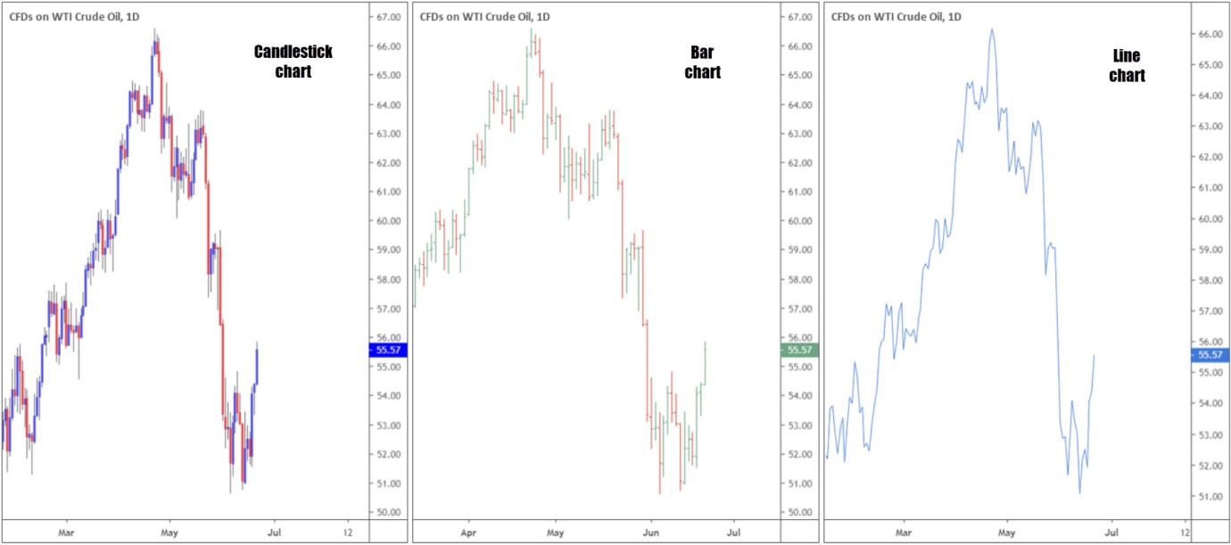
Traders and investors who adopt technical analysis typically use price charts to identify market behaviour. For that reason, before learning anything else, it is vital to understand the basics of each widely used chart (see figure 1.1 for a visual representation):
- A bar chart, often labelled OHLC chart, employs the use of bars, representing the trading range of a security over a given time period. Offering additional information over its more basic counterpart: the line chart, a completed bar provides the open price (O), high price (H), low price (L) and the closing (C) price.
- A candlestick chart, similar to a bar chart, also offers information on the open (O), high (H), low (L) and closing (C) prices over a given time period. The difference between the bar and candlestick chart falls on the thickness of the candle body.
- A line chart is the most basic chart used in finance, created by connecting a series of closing prices. Simple line charts are useful when studying long-term trends. Journalists often use line charts to give the reader a quick and concise picture.
(Figure 1.1)
Candlestick structure
Knowing the framework of a candlestick is essential in order to identify profitable patterns.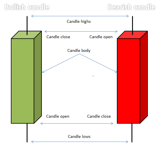
Used extensively throughout the trading community, each candle delivers a story.
- The opening price is the beginning of the candle’s creation.
- The closing price forms at candle completion.
- The highest price – also known as a candle’s upper shadow – is at a candle’s high. It demonstrates the highest price paid over that period.
- The lowest price – known as the candle’s lower shadow – is at the candle’s low. It signifies the lowest price paid over the candle’s life.
The central portion of a candlestick – that is between the candle open and the close – is known as the real body or candle body. Candlesticks generally implement a colour-coded system to signify direction, enabling traders to quickly decipher whether price is rising or falling.
A green body emphasises a bullish (buying) tone, whilst its red counterpart demonstrates a bearish (selling) presence. The closing price in a bullish setting adds significance in that it determines overall buyer conviction during the candle period. Generally speaking, the longer the body is, the more intense the buying pressure was.
Historically, candlestick charts established a presence in the 18th century by Munehisa Homma, a Japanese rice trader of financial instruments. In December 1989, Steve Nison – known worldwide as the father of modern candlestick charting – wrote an introductory article on Japanese candlesticks. It turned out he was one of the few Americans familiar with this centuries-old Japanese technique. Since then, Japanese candlestick patterns have become a staple in many trading methodologies throughout the western world.
Widely used candlestick formations
Candlestick structure is popular among technical analysts due to its striking representation of price action. The analytical difference between Japanese candlestick patterns and western bar patterns is the emphasis on the opening and close.
Candlestick patterns are short-term configurations, generally consisting of no more than three candles. Many of these patterns also have western equivalents. Candlestick patterns form according to the position of the body, the shadows, the location of the candlestick to its neighbouring candles and the confirmation rules.
Another point worth highlighting is most candlestick patterns are either top of bottom formations. The analyst, therefore, must ensure preceding price action is in a defined trend.
One and two-candle patterns
The hammer and inverted hammer:
Both the hammer and inverted hammer patterns are identical formations, with the only difference being they are an opposite mirror image of one another.
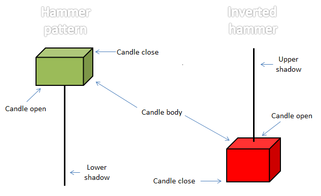
Each should house an upper/lower shadow at least two to three times the length of the candle body. The colour of the body is irrelevant, though traders must ensure the candle close is, or nearly is, the highest/lowest price. In other words, look for the candle to close either at its highs or lows.
The hammer and inverted hammer formations are bullish reversal patterns, mainly occurring at the bottom of downtrends or at troughs. After a downtrend, the two patterns can signal a downtrend’s end might be in store.
The hanging man and shooting star:
The hanging man and shooting star patterns are a mirror image of the hammer and inverted hammer formations, respectively. The only difference is the name and the location of the pattern.
The hanging man configuration – the same structural measurements as the hammer pattern – is a topping structure. In other words it should form at a peak. The shooting star pattern, with the same structural representations as the inverted hammer, is found also at a peak.
The engulfing formation:
A bearish or bullish engulfing pattern is a two-candle formation in which the second body engulfs the first.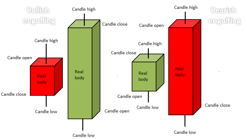
Because this pattern is there to recognise a trend reversal, a clear trend must precede its formation. In a market uptrend, for example, a bearish engulfing pattern indicates a possible top. The bearish engulfing structure consists of a small green candle (or whichever colour scale you choose to represent a bullish move), followed by a red candle that engulfs the green body. Traders should look for the engulfing candle to immerse the entire range of its previous candle.
The Doji candlestick pattern:
The Doji pattern is a commonly found candlestick arrangement. Its shape is typically small in length (small trading range) with an 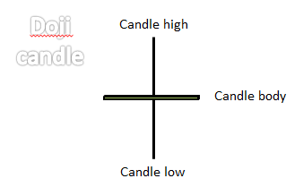 opening and closing price that are virtually equal. On its own, it is a neutral candle and suggests the market is in equilibrium and affected by indecision. Although some candlestick traders will disagree, the creation of a Doji tells traders it is often best to hit the side lines until renewed direction is visible.
Traders may also want to note long-legged Doji formations can also occur – the upper and lower shadows are elongated. This means the market entered a phase of indecision, usually after a huge expansion in volatility.
Confirmation
Now you have a good idea how to identify some of the most popular candlestick patterns, how do we trade them?
Alone, without additional supporting evidence, candlestick trading results fare poorly.
To use these patterns successfully, a trader must familiarise themselves with the underlying trend and additional technical indicators. Although a number of techniques employing candlestick configurations are available across the internet, and through various training programmes, simplicity is key to success.
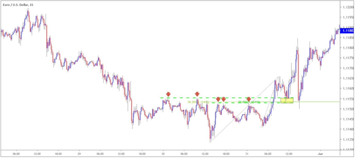
Among the technical community, candlestick signals are often employed as a means of confirmation. As an example, check out figure 1.2, the M15 EUR/USD chart. Two clean layers of resistance-turned support levels come together to form a tight buy zone (yellow). The initial test of the area formed a half-hearted hammer pattern (blue arrow – the real body of the candle was large in comparison to its lower shadow). Stronger confirmation emerged shortly after in the shape of an inverted hammer pattern (pink arrow).
Entering long after the formation of the inverted hammer configuration, in this case, offered incredibly attractive risk/reward.

(Figure 1.2)
Another example where candlestick confirmation is used can be found at key Fibonacci levels. Although the 50.0% value at 1.1141 is not technically a Fibonacci ratio, the 38.2% line is, which is also found at 1.1141. Note price action in figure 1.3 bounces off 1.1141 to the point and begins bottoming. Only after the inverted hammer formation highlighted above in figure 1.6 develops, do we have confirmation to go higher.
One final point worth highlighting is to always wait for the confirming candlestick formation to close. Trying to interpret how a candle will close is difficult, as financial markets can move a number of points in the space of seconds.
(Figure 1.3)
Further reading
Having a means of confirming an area of interest is exceedingly beneficial. Japanese candlesticks offer accurate confirmation signals and provide traders entry and risk levels to work with.
For traders looking to enhance their understanding of candlestick chart patterns, the best resource on Japanese candlestick analysis is Steve Nison’s book: Japanese Candlestick Charting Techniques: A Contemporary Guide to the Ancient Investment Techniques of the Far East.
Nison’s masterpiece underlines many popular Japanese candlestick signals, such as the evening and morning star (a three-candle reversal pattern), dark cloud cover and piercing line formation, alternative Doji patterns: gravestone Doji and dragonfly Doji, and many more.