As the sea rises and falls along a shoreline, price action ebbs and flows in a similar manner.
Perhaps one of the most disregarded facets of technical analysis, yet one of the most essential, is the identification of market structure.
Many analysts identify market structure as an art form, constantly evolving from one phase to another. While having the ability to recognise market structure is a result of extensive experience, distinct characteristics exclusive to each type of structure are visible, helping newer traders assemble a base for more advanced study.
Basic price movement
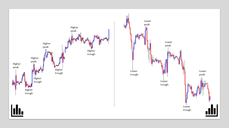
At its core, market structure accommodates a series of peaks and troughs. Reasonably straightforward to identify, peaks and troughs are distinguishable on all timeframes and aid trend recognition.
Figure 1.1 illustrates basic market movement, consisting of four key swing points:
- HH – Higher high (higher peak)
- HL – Higher low (higher trough)
- LL – Lower low (lower trough)
- LH – Lower high (lower peak)
If price is marching upwards, producing higher peaks/troughs, then the trend is typically considered up. Conversely, if price is facing a southerly trajectory and forming lower troughs/peaks, price is declining in a downtrend.
Readers may also want to acknowledge the terms, correction and pullback, often used among traders and investors.
Due to several things, such as profit taking and technical selling at structure (resistance), corrections form in bull markets, the distance travelled from the higher peak to the higher trough. The correction is complete once price rises above the previous peak formed within the trend. Corrections can also take shape by way of a consolidation phase. A breakout through the resistance level holding price action lower indicates strength within the trend, whereas a push lower suggests the current trend may be reversing.
A pullback forms within a downtrend, the distance travelled from the lower trough to lower peak. Like a correction, a pullback is largely due to profit taking and technical buying at structure (support). A pullback is complete once price declines beyond the recently formed lower trough.
(FIGURE 1.1)
Trend classification
Identifying three trend phases is sufficient to plot a defined trend, and potentially highlight a tradeable direction.
Major trends. Bull and bear markets are generally sustained moves, sometimes extending over years.
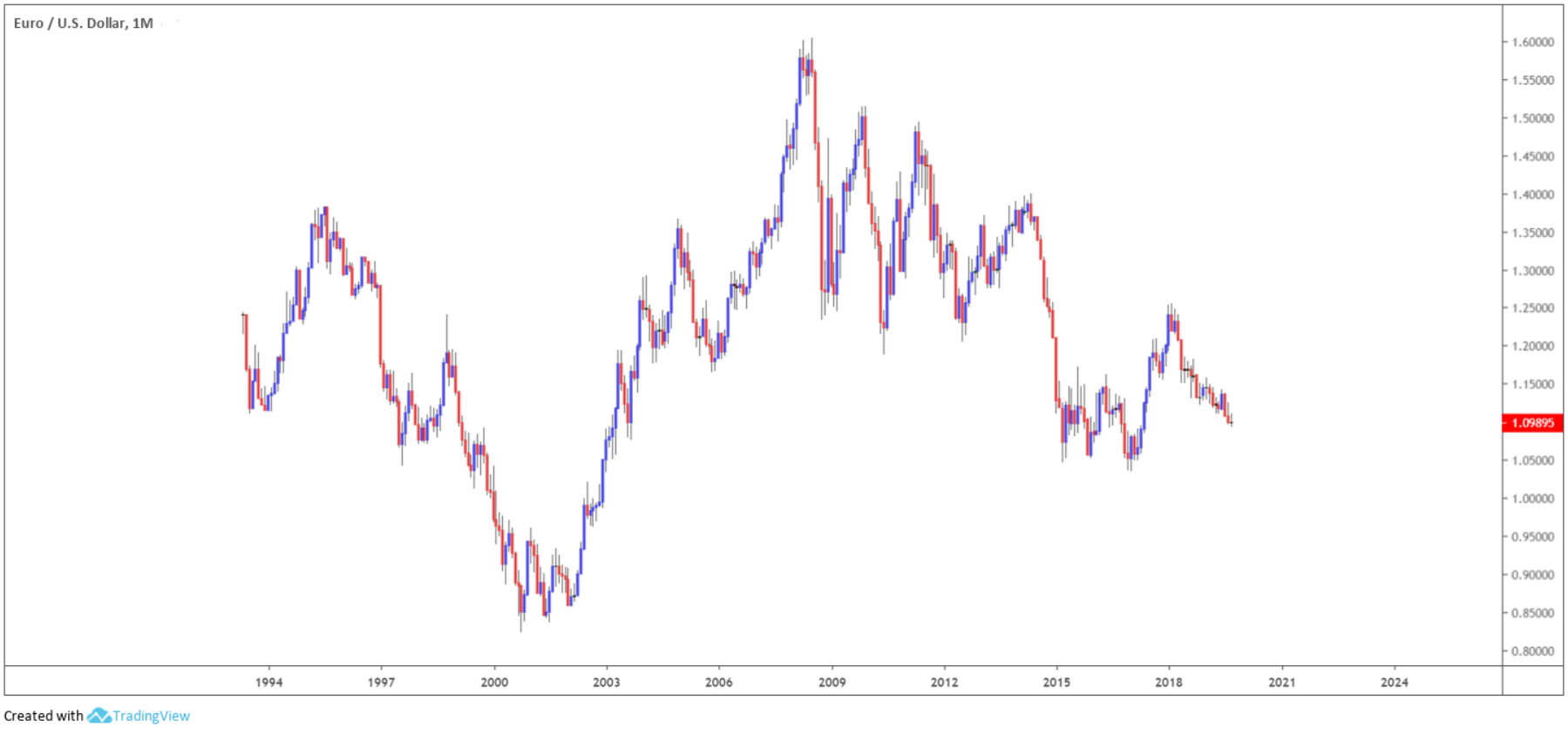
Figure 1.2, the EUR/USD, shows a major trend on the monthly timeframe. Given the long-term nature of this higher timeframe, any trend would be founded on the back of fundamentals, such as government policy, international trade and investors’ expectations.
Figure 1.2 demonstrates a major bull market existed from the year 2000 through to early 2008, where on April 22, the euro rose more than $1.60. The financial crisis of 2008, however, had a considerable effect on the foreign exchange market.
Since topping in 2008, EUR/USD has been entrenched within a long-term downtrend, producing a series of lower troughs and lower peaks. Long-term structure analysis, following the formation of a potential lower peak in early 2018, therefore, expects a fresh lower trough to emerge.
(FIGURE 1.2)
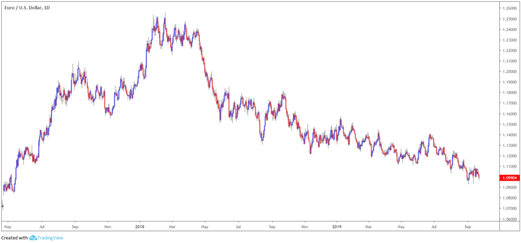
Medium-term trends. Figure 1.3, still focusing on EUR/USD, finds its medium-term trend on the daily timeframe. With the EUR/USD’s major trend showing signs of continuation to the downside, the daily timeframe should reinforce this picture.
Figure 1.3 displays a downtrend since topping in 2018. Recent price action on the daily timeframe appears to be topping by way of a lower peak, poised to potentially explore lower prices and create a fresh lower trough. This, therefore, confirms the major trend’s position on the monthly timeframe.
(FIGURE 1.3)
Intraday trends. Trends in this category are normally short in duration. Technical buying and selling contribute to this movement, aided by daily macroeconomic news releases.
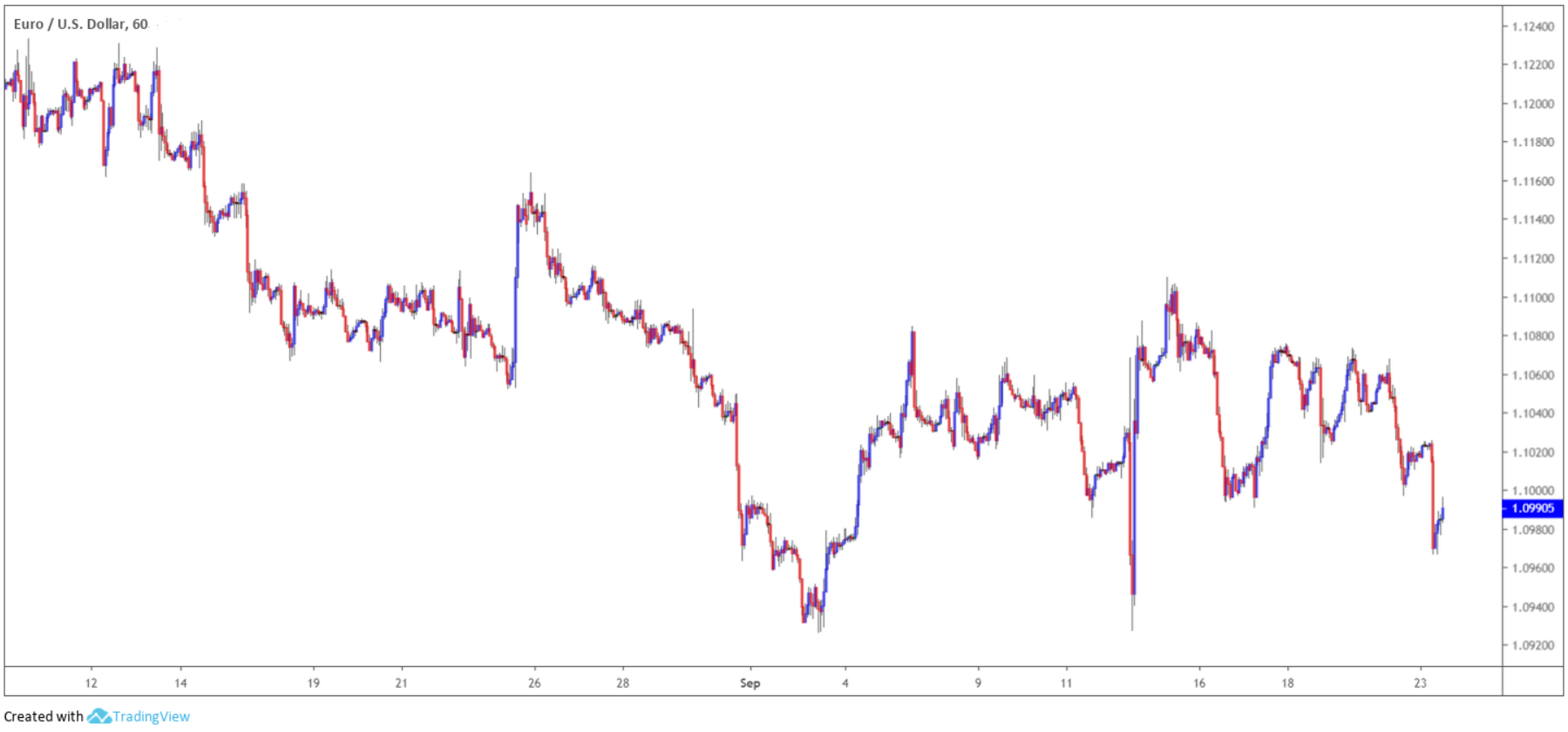
Figure 1.4 illustrates H1 movement, showing the EUR/USD formed a higher peak on September 13 following the break of the September 5 peak.
As of current price, the candles are in the process of forming a correction, with the expectation of a potential higher peak forming. However, the deeper price action corrects, the less likely a higher peak will form. If figure 1.4 were your traded timeframe, entering long this far south within the current correction is chancy, even more so knowing both monthly and daily trends emphasise a downward tone.
(FIGURE 1.4)
Trend corrections/pullbacks, irrespective of the trend phase, typically favour the 38.2% and 61.8% Fibonacci retracement ratios.
Many market participants seldom entertain a correction/pullback if the 38.2% value is not reached. And any deeper/higher than a 61.8% correction/pullback, traders may experience a possible failure swing, meaning the trend phase is likely to fail on that timeframe. In the case of figure 1.4, the correction exceeded 61.8%, therefore, the odds favour further selling.
Trading basic market structure
Forecasting trend direction using the three highlighted timeframes is just one alternative.
Your trading style; that is, whether you’re an intraday trader, a swing trader or a long-term trader, will help determine which trend category (timeframes) your best suited to follow and base trading decisions from.
For example, if you have full-time obligations with time at the screen limited, focusing on a similar trend cycle as shown in previous charts is an idea maybe worth considering.
If you favour lower-timeframe movement, say the M5 scale, nevertheless, focusing on M5 swings to trade is an option, while taking into account trend movement on M30 and H4/daily timeframes. It is important to consider market structure on at least three timeframes.
Figure 1.5, for example, shows a bullish trend in process on a GBP/USD H4 chart. However, the correction from the most recent peak (green arrow) is reasonably deep and approaching the recent higher trough (blue arrow). Therefore, this signals sellers may have the upper hand, with a break of the current higher trough perhaps on the cards.
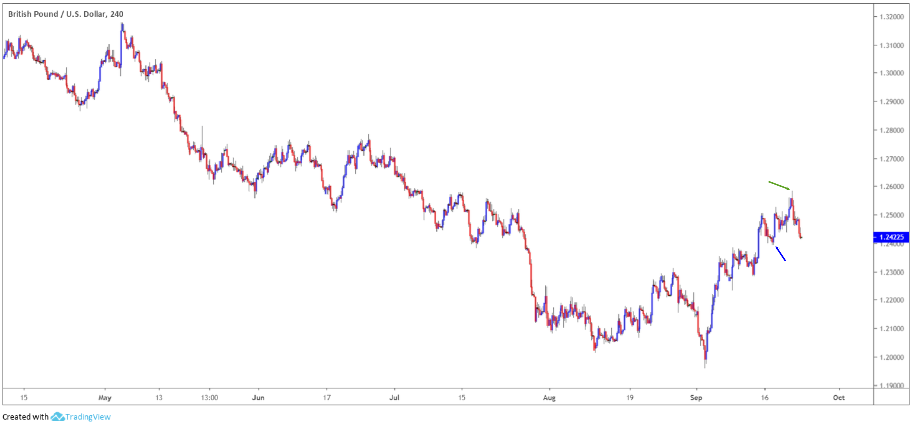
(FIGURE 1.5)
Figure 1.6 shows a break of a clear higher trough formation, signalling the buyers are fading, confirming the weak H4 picture.
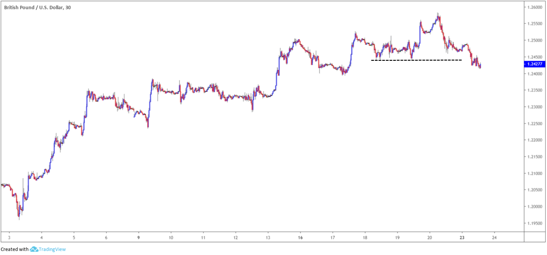
(FIGURE 1.6)
And finally, as shown in figure 1.7, we can see the M5 framework offers a bearish scenario after forming a lower trough and lower peak (blue and green arrows), as per the back arrows.
Selling this market has traders in line with weakening H4 trend flow, and in conjunction with M30 trend structure, which has already violated a recent higher trough.
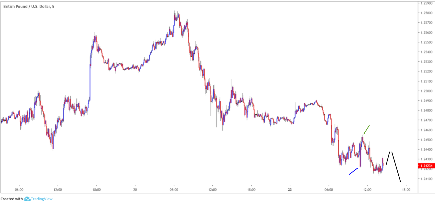
(FIGURE 1.7)
Stay ahead of the curve
Mapping out your charts and basing trading ideas off market structure is an organised approach, gaining a solid perspective towards future price action.
Like many other technical tools, combining market structure in isolation is not recommended. Employing market structure analysis along with other technical analysis such as support and resistance, chart patterns, Fibonacci studies or trend lines, for instance, will aid in selecting the most optimal areas to buy/sell in line with market structure. This, ultimately, forms a strong basis for a well-defined trading strategy.